PythonでGO Enrichmentの結果を図示する
TL;DR
RにはGO Enrichmentの結果をいい感じに図示してくれるライブラリがいくつかありますが(e.g., clusterProfiler, rrvgo etc.,)、Pythonにはありません。そこで、似たような図の作成方法をメモとしてまとめます。
個人的に図の微調整などはPythonのほうが知識もあって楽なのでPythonで書きたいという動機がありますが、ggplotが好きな人/Rに詳しい人は最初からRを使うのがおすすめです。
また、個人の趣味でpandasではなくpolarsを使用しています。polars、非常に体験がよいのでおすすめです。
Dataset
列の意味としては以下を想定しています。
- term: GO Term ID
- score: -log10(padj)を想定
- size: アノテーションに含まれる遺伝子数)
- name: Go Termの名前。ラベルに使う。
- cluster: 適当なクラスターの名前
CSV data
example.csv
Import & 設定
defaultでは以下の設定・ライブラリを利用している。
単純なプロット
Barplot
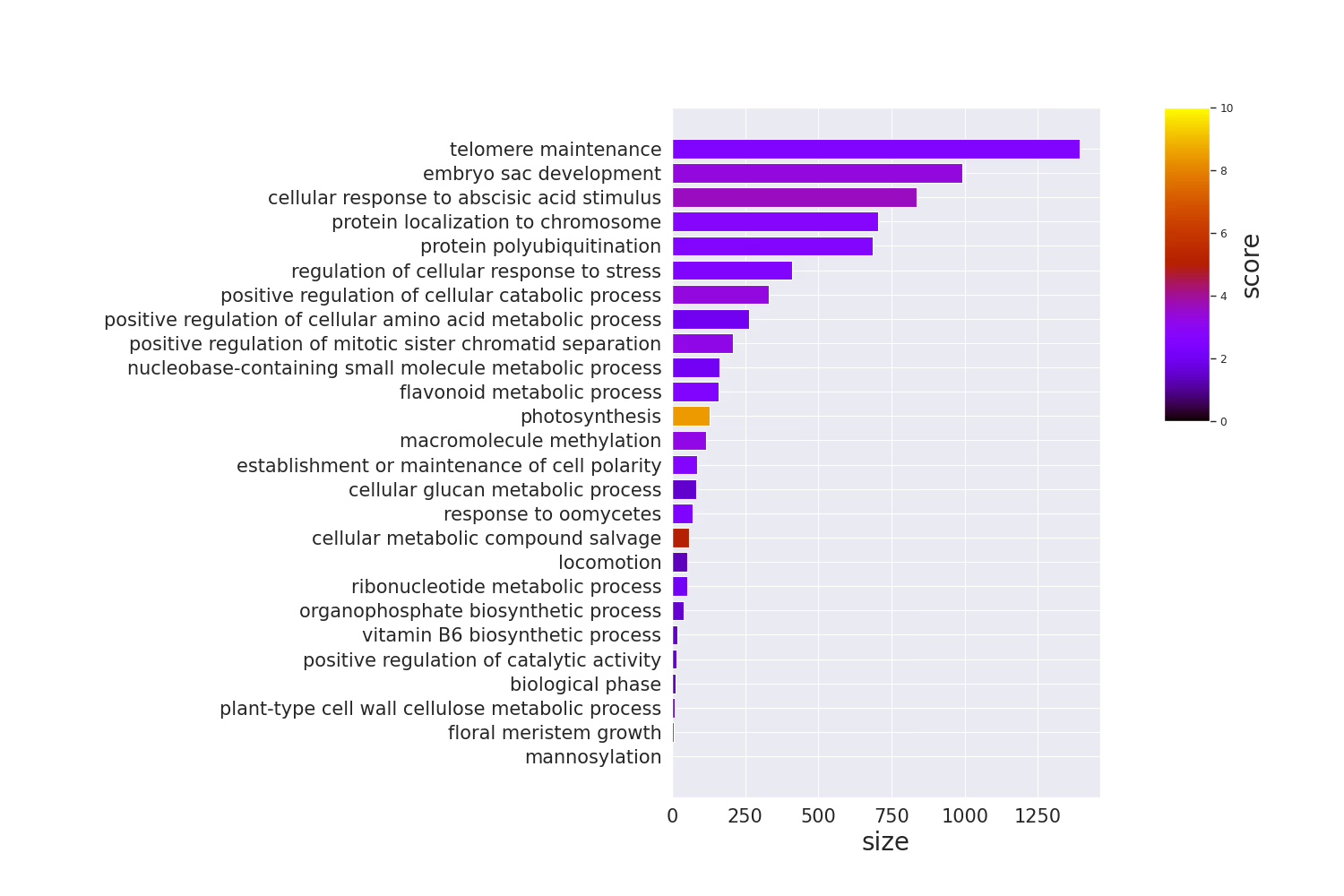
Code
dotplot
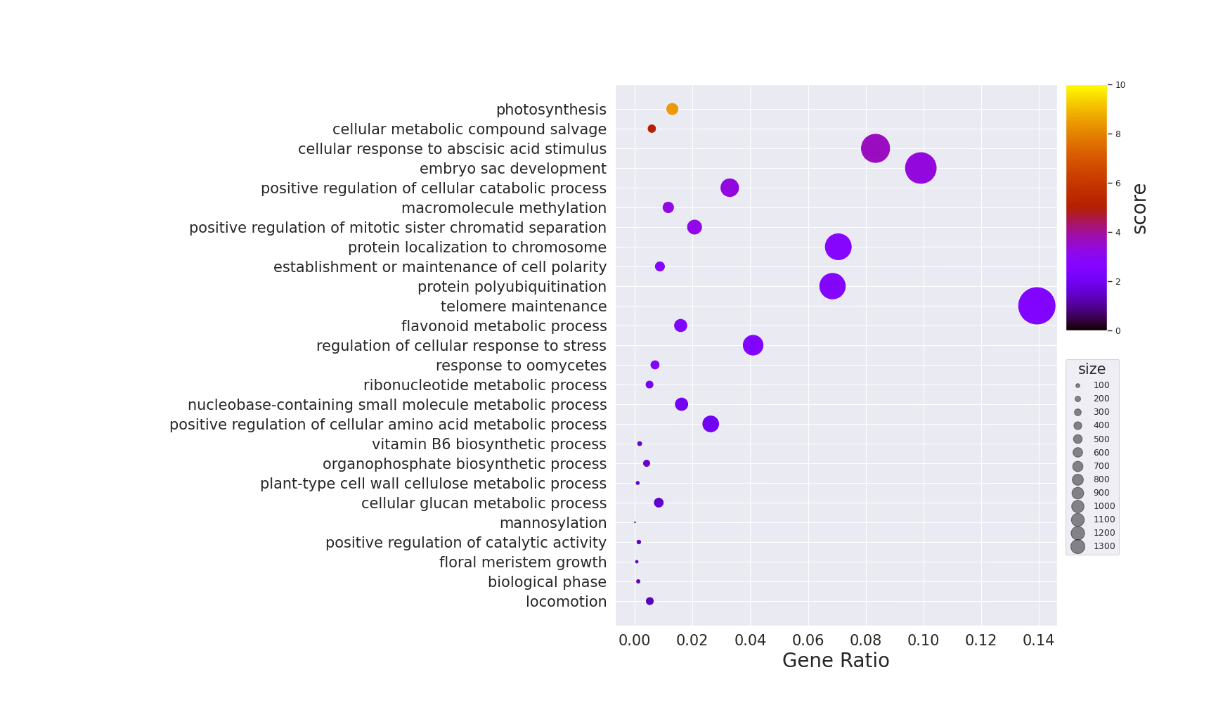
Code
グループごとのdotplot
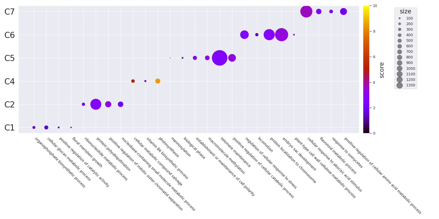
Code
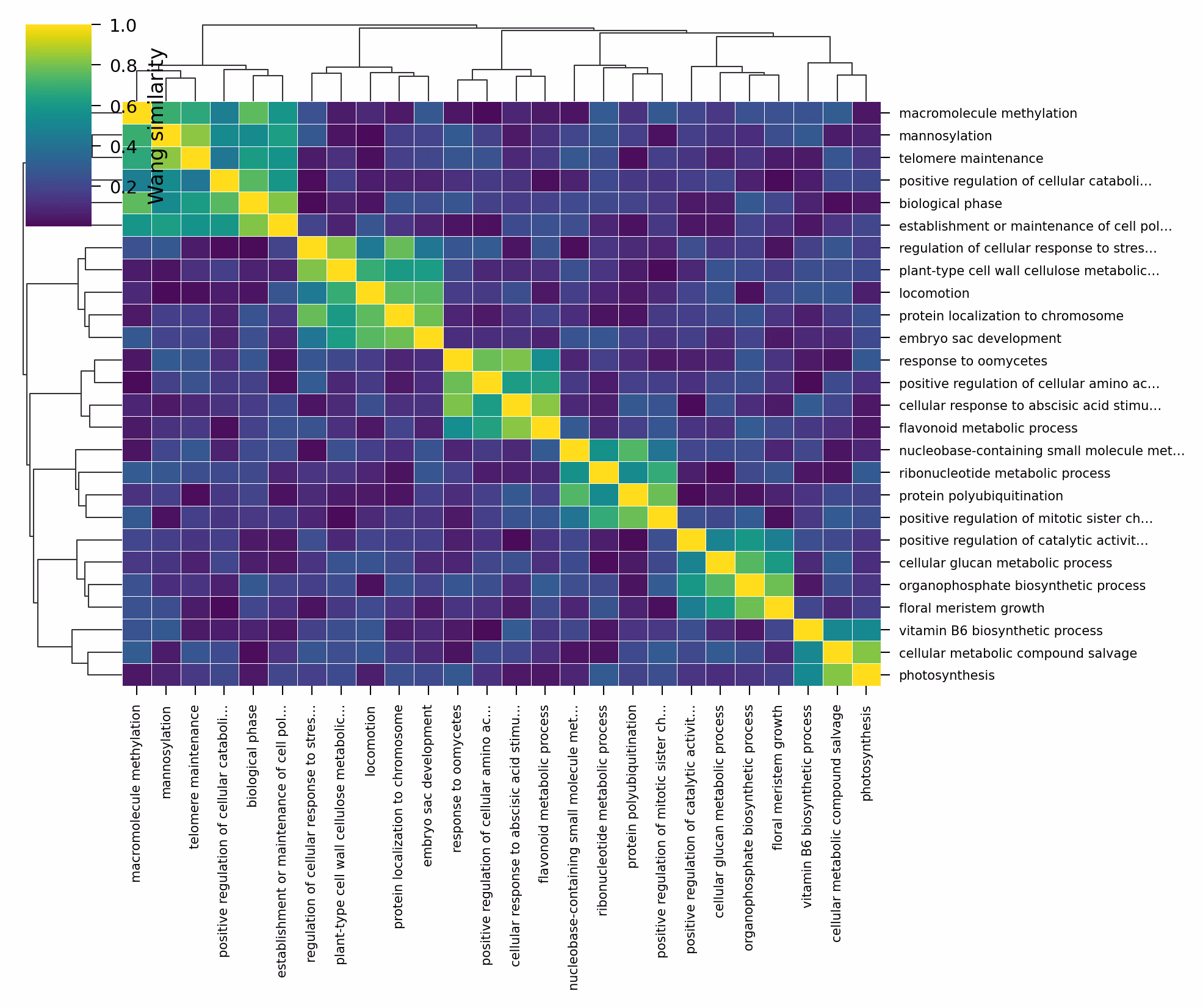
Similarityを利用したプロット
GO Termにはsimilarityがあります。Overview of semantic similarity analysisあたりが詳しいです。これは、Pythonではgoatoolsを利用することで計算できます。RだとGoSemSimが利用できます。
goatoolsでは、以下の手法をサポートしているようです。
IC Base
- Resnik
- Philip, Resnik. 1999. “Semantic Similarity in a Taxonomy: An Information-Based Measure and Its Application to Problems of Ambiguity in Natural Language.” Journal of Artificial Intelligence Research 11: 95–130.
- Lin
- Lin, Dekang. 1998. “An Information-Theoretic Definition of Similarity.” In Proceedings of the 15th International Conference on Machine Learning, 296—304. https://doi.org/10.1.1.55.1832.
Graph Base
- wang
- Wang, James Z, Zhidian Du, Rapeeporn Payattakool, Philip S Yu, and Chin-Fu Chen. 2007. “A New Method to Measure the Semantic Similarity of GO Terms.” Bioinformatics (Oxford, England) 23 (May): 1274–81. https://doi.org/btm087.
Similarityベースの可視化では、追加で以下のライブラリを使用します。
Similarity Matrixの計算
まず、GO Term間のペアワイズなsemantic similarityを計算します。Wang法はグラフ構造のみを利用するため、アノテーションデータが不要で手軽に使えます。IC-based(Resnik, Lin)を使いたい場合は、別途アノテーションコーパスとTermCountsの準備が必要です。
Code
クラスタリング
Similarity matrixからクラスタを自動生成することもできます。サンプルデータにはすでにcluster列がありますが、実データではsimilarityに基づいてクラスタリングするのが一般的です。scipyの階層クラスタリングを利用します。
Code
Similarity Heatmap
Similarity matrixをヒートマップとして可視化します。seabornのclustermapを使うと、階層クラスタリングの樹形図(デンドログラム)も同時に表示できるので、GO Term間の関係が直感的にわかります。
Code
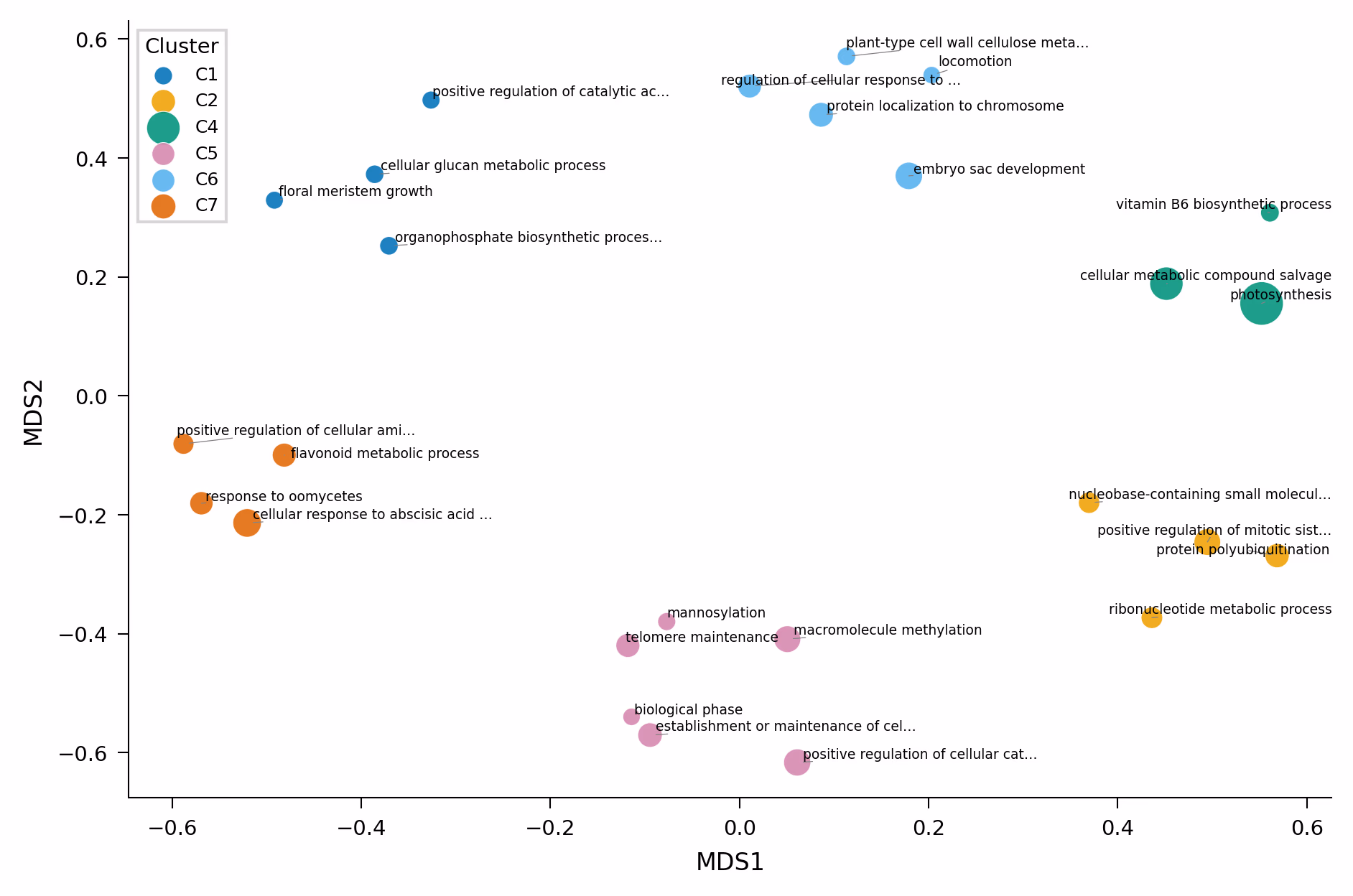
MDSによるScatter Plot
Similarity matrixをMDS(Multi-Dimensional Scaling)で2次元に圧縮し、散布図として可視化します。Rのrrvgoのscatter plotに相当するものです。意味的に近いGO Termが近くに配置されるので、enrichmentの全体像を把握するのに便利です。
Code
MDSの代わりにUMAPを使うこともできます。特にGO Termの数が多い場合はUMAPのほうが適切な場合があります。
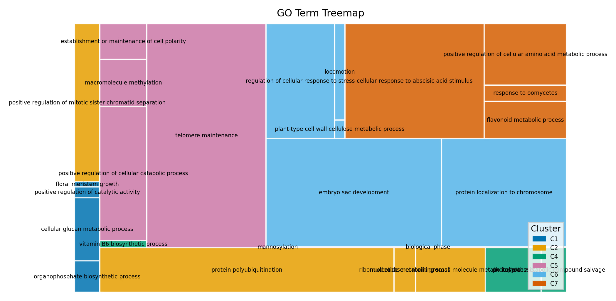
Treemap
Treemapは各GO Termを矩形として描画し、面積でサイズ(遺伝子数)を、色でクラスタを表現します。RのrrvgoにおけるtreemapPlotに相当する可視化です。enrichmentされたGO Termの全体的な構成を俯瞰するのに適しています。
Code
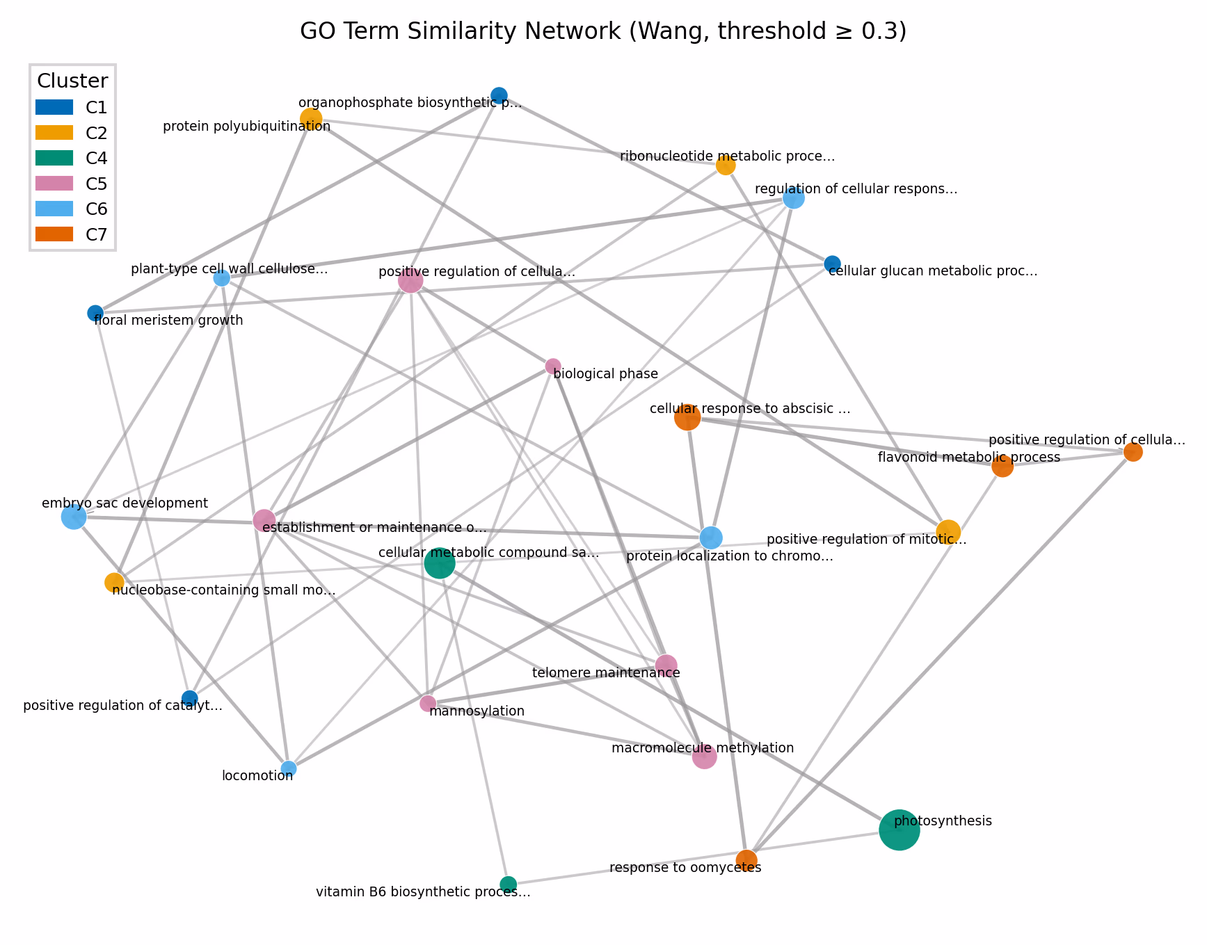
Similarity Network(NetworkX)
networkxを使って、GO Term間のsimilarityをネットワークとして可視化することもできます。ノードがGO Term、エッジがsimilarityを表し、類似度が閾値以上のペアのみをエッジとして描画します。ネットワークレイアウトはspring layout(force-directed)を使い、類似度が高いノード同士が近くに配置されます。
Code
閾値(threshold)を変えることでネットワークの密度を調整できます。閾値を高くすると類似度の高いペアのみがエッジとして残り、低くするとより多くの接続が表示されます。
また、エッジの重みを使ったコミュニティ検出(例: Louvainアルゴリズム)も可能です。