Using Beeswarm Plots in Python
TL;DR
Sometimes you want to get an overview of your data without worrying about summary statistics. Beeswarm plots are useful for visualizing data distributions. With seaborn, beeswarm plots can be easily created in Python.
Additionally, when combined with violin plots and similar visualizations, beeswarm plots can elegantly represent both data distribution and summary statistics.
For R, please refer to this site. The official documentation is also well-written and recommended.
Preparation
Installing seaborn
Loading Data
This tips dataset is perfect for seaborn demos, as you would expect from an officially provided dataset. I considered replacing it with something from sklearn, but tips was just too good.
Basic Plot
Output
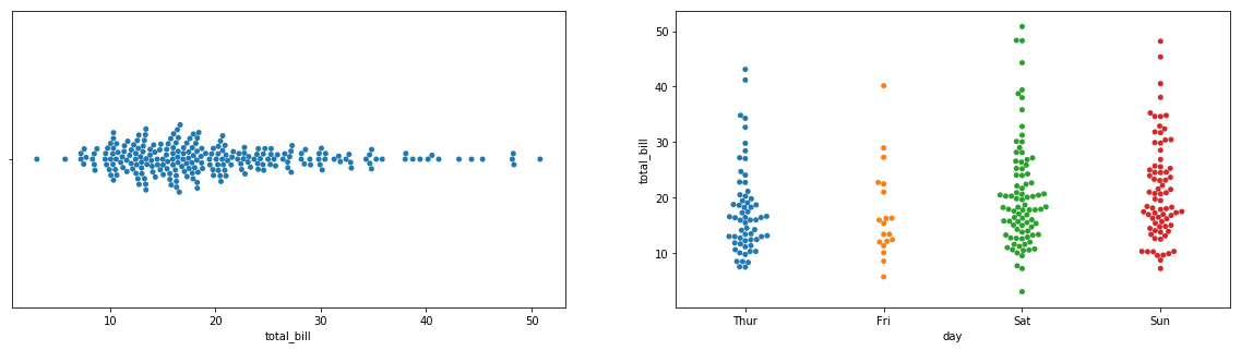
Splitting by hue
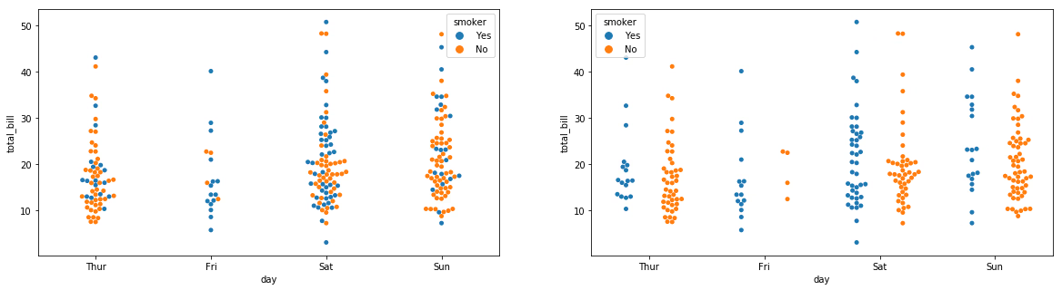
Like other seaborn charts, you can color-code using hue. The dodge argument lets you choose whether to mix or separate the groups within the chart.
Output
Combining with Violin Plots
Combining with other plots gives a more data-science feel. Let's use violin plots. We also compare with stripplot, which is used for similar purposes.
Output
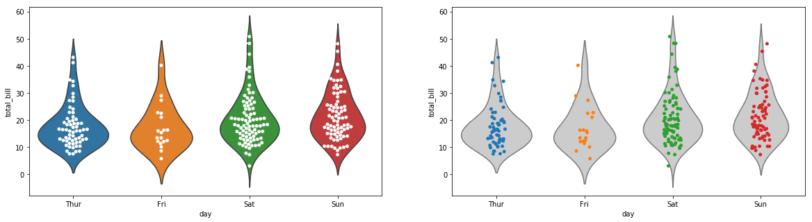
The beeswarm plot seems more readable since it also shows the distribution pattern. The downside is that it cannot display everything when there are too many data points. The best choice depends on the data you want to represent, but beeswarm plots are a strong option to consider.