While R has several libraries that nicely visualize GO Enrichment results (e.g., clusterProfiler, rrvgo, etc.), Python does not. This article summarizes how to create similar plots in Python.
Personally, I have more experience fine-tuning plots in Python, which motivates me to write this in Python. However, if you prefer ggplot or are well-versed in R, I recommend using R from the start.
Also, as a personal preference, I use polars instead of pandas. Polars provides an excellent developer experience and is highly recommended.
Dataset
The columns are expected to have the following meanings:
term: GO Term ID
score: Assumes -log10(padj)
size: Number of genes included in the annotation
name: GO Term name, used as a label
cluster: An arbitrary cluster name
CSV data
example.csv
term,score,size,name,cluster
GO:0090407,1.5297085894511266,41,organophosphate biosynthetic process,C1
GO:0006073,1.5163222189613395,83,cellular glucan metabolic process,C1
GO:0043085,1.44498285471817,14,positive regulation of catalytic activity,C1
GO:0010451,1.42343275529096,7,floral meristem growth,C1
GO:0009259,2.08444273888555,51,ribonucleotide metabolic process,C2
GO:0000209,2.626510646478822,685,protein polyubiquitination,C2
GO:1901970,3.197995679060633,207,positive regulation of mitotic sister chromatid separation,C2
GO:0055086,2.043050310202272,162,nucleobase-containing small molecule metabolic process,C2
GO:0043094,4.978646909720386,59,cellular metabolic compound salvage,C4
GO:0042819,1.5612111272483267,17,vitamin B6 biosynthetic process,C4
GO:0015979,8.466807502800558,130,photosynthesis,C4
GO:0097502,1.45417892854421,1,mannosylation,C5
GO:0044848,1.36510627820935,12,biological phase,C5
GO:0007163,2.6923744596164827,87,establishment or maintenance of cell polarity,C5
GO:0043414,3.215776159654917,116,macromolecule methylation,C5
GO:0000723,2.572069750528699,1393,telomere maintenance,C5
GO:0031331,3.2990295934320666,329,positive regulation of cellular catabolic process,C5
GO:0080135,2.5196148192030727,410,regulation of cellular response to stress,C6
GO:0040011,1.35544252617625,52,locomotion,C6
GO:0034502,2.739128030964704,705,protein localization to chromosome,C6
GO:0009553,3.35598374726875,991,embryo sac development,C6
GO:0052541,1.5212716561130444,10,plant-type cell wall cellulose metabolic process,C6
GO:0071215,3.6449534934267973,834,cellular response to abscisic acid stimulus,C7
GO:0009812,2.5663773876723597,159,flavonoid metabolic process,C7
GO:0002239,2.42790703640653,70,response to oomycetes,C7
GO:0045764,1.9573492416484901,263,positive regulation of cellular amino acid metabolic process,C7
Imports & Configuration
The following settings and libraries are used by default.
import seaborn as sns
import matplotlib.pyplot as plt
import matplotlib as mpl
import polars as pl
print(sns.__version__)# 0.11.2print(pl.__version__)# 0.13.36print(mpl.__version__)# 3.4.3# Seaborn settings — adjust to your preferencesns.set(style="darkgrid", palette="muted", color_codes=True)sns.set_context("paper")
Basic Plots
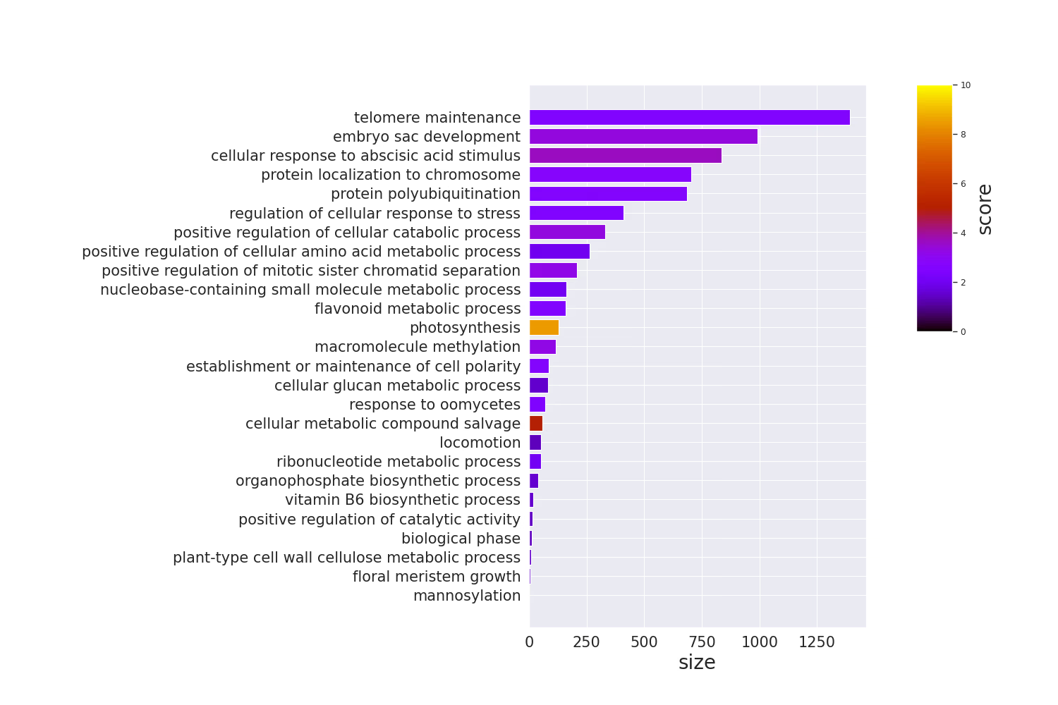
Barplot
Code
# Add extra left margin since GO Term names go on the y-axisplt.rcParams['figure.subplot.left']=0.5df = pl.read_csv("./example.csv").sort("size")terms = df.select("name").to_series().to_list()sizes = df.select("size").to_series().to_list()fig = plt.figure(figsize=(15,10))xgs =10# Use gridspec to manually place the colorbar# The colorbar only needs the upper half, so split y into 2 as wellgs = fig.add_gridspec(2, xgs)# Leave space for the colorbarax = fig.add_subplot(gs[0:2,0:xgs-2])# Convert scores to RGBAcmap = plt.get_cmap("gnuplot")norm = mpl.colors.Normalize(vmin=0, vmax=10)scores = df.select("score").to_series().apply(lambda x: cmap(norm(x))).to_list()# barplotax.barh(terms, sizes, color=scores)ax.tick_params(axis="x", labelsize=15)ax.set_xlabel("size", fontsize=20)ax.tick_params(axis="y", labelsize=15)# Create colorbarcbar = fig.add_subplot(gs[0, xgs-1])mpl.colorbar.Colorbar( cbar, mappable=mpl.cm.ScalarMappable(norm=norm, cmap=cmap), orientation="vertical",).set_label("score", fontsize=20)plt.show()
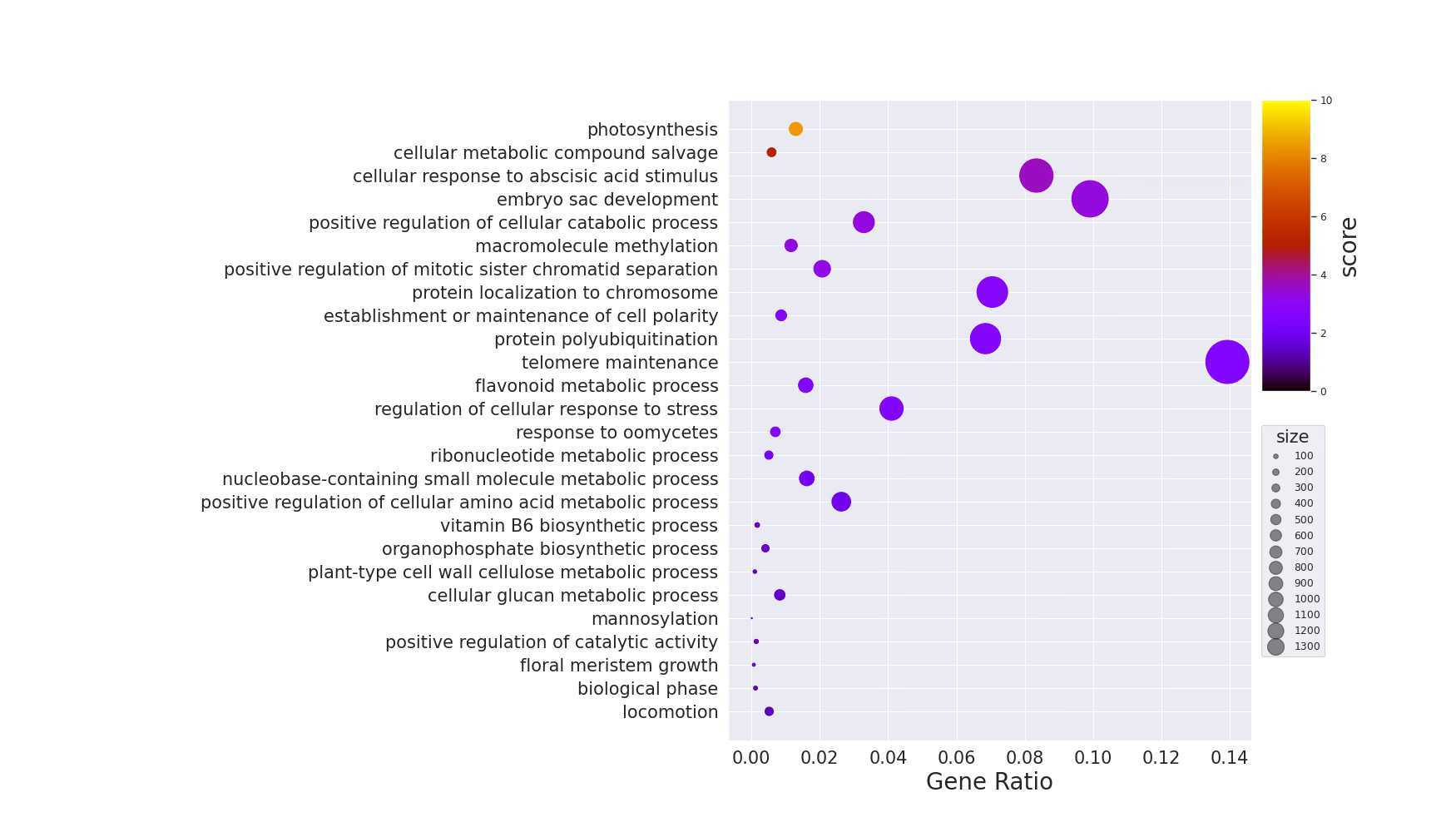
Dotplot
Code
# Add extra left margin since GO Term names go on the y-axisplt.rcParams['figure.subplot.left']=0.5background_gene =10000df = pl.read_csv("./example.csv").sort("score")terms = df.select("name").to_series().to_list()sizes = df.select("size").to_series().to_list()ratio =list(map(lambda x: x / background_gene, sizes))vmin =0vmax =10fig = plt.figure(figsize=(17.5,10))xgs =10# Use gridspec to manually place the colorbar# The colorbar only needs the upper half, so split y into 2 as wellgs = fig.add_gridspec(2, xgs)# Leave space for the colorbarax = fig.add_subplot(gs[0:2,0:xgs-1])cmap = plt.get_cmap("gnuplot")scores = df.select("score").to_series().to_list()# dotplotscatter = ax.scatter(ratio, terms, c=scores, s=sizes, cmap=cmap, vmin=vmin, vmax=vmax)ax.tick_params(axis="x", labelsize=15)ax.set_xlabel("Gene Ratio", fontsize=20)ax.tick_params(axis="y", labelsize=15)handles, labels = scatter.legend_elements(prop="sizes", alpha=0.5)legend = ax.legend( handles, labels,# Simple positioning doesn't place it well, so manually adjust with bbox_to_anchor bbox_to_anchor=(1.15,0.5), title="size", title_fontsize=15, markerscale=0.4)cbar = fig.add_subplot(gs[0, xgs-1])# Add colorbar# Use ColorbarBase for full control over placementnorm = mpl.colors.Normalize(vmin=vmin, vmax=vmax)mpl.colorbar.Colorbar( cbar, mappable=mpl.cm.ScalarMappable(norm=norm, cmap=cmap), orientation="vertical",).set_label("score", fontsize=20)plt.show()
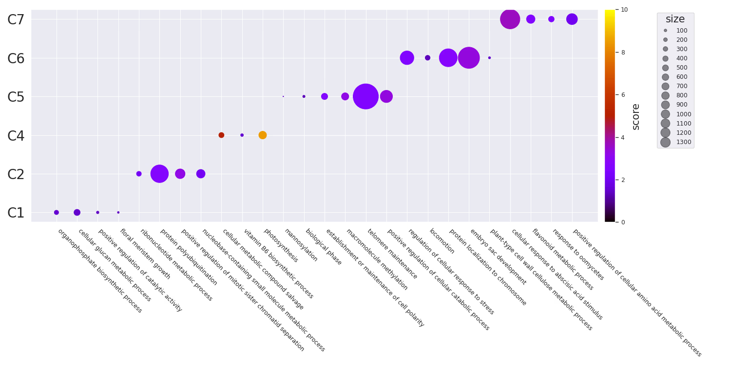
Dotplot by Group
Code
# Seaborn settings — adjust to your preferencesns.set(style="darkgrid", palette="muted", color_codes=True)sns.set_context("paper")# Add extra bottom margin since GO Term names go on the x-axisplt.rcParams['figure.subplot.bottom']=0.5df = pl.read_csv("example.csv")terms = df.select("name").to_series().to_list()clusters = df.select("cluster").to_series().to_list()fig = plt.figure(figsize=(15,7.5))ax = fig.add_subplot(111)# Save scatter for adding a colorbar latercmap = plt.get_cmap("gnuplot")scatter = ax.scatter( terms, clusters, s=df.select(pl.col("size")).to_series().to_list(), c=df.select("score"), cmap=cmap, vmin=0, vmax=10,)# Axis label control# When rotating, the anchor position must be set appropriately with ha# e.g., 315 -> left, 45 -> rightax.set_xticklabels(terms, rotation=315, ha="left")ax.tick_params(axis="y", labelsize=20)# Create a legend for sizehandles, labels = scatter.legend_elements(prop="sizes", alpha=0.5)legend = ax.legend( handles, labels,# Simple positioning doesn't place it well, so manually adjust with bbox_to_anchor bbox_to_anchor=(1.175,1), title="size", title_fontsize=15, markerscale=0.4)# Add colorbarfig.colorbar(scatter, ax=ax, pad=0.01).set_label("score", size=15)fig.tight_layout()plt.show()
Similarity-Based Plots
GO Terms have a notion of similarity. See Overview of semantic similarity analysis for details. In Python, this can be computed using goatools. In R, you can use GoSemSim.
goatools supports the following methods:
IC-Based
Resnik
Philip, Resnik. 1999. "Semantic Similarity in a Taxonomy: An Information-Based Measure and Its Application to Problems of Ambiguity in Natural Language." Journal of Artificial Intelligence Research 11: 95–130.
Lin
Lin, Dekang. 1998. "An Information-Theoretic Definition of Similarity." In Proceedings of the 15th International Conference on Machine Learning, 296—304. https://doi.org/10.1.1.55.1832.
Graph-Based
Wang
Wang, James Z, Zhidian Du, Rapeeporn Payattakool, Philip S Yu, and Chin-Fu Chen. 2007. "A New Method to Measure the Semantic Similarity of GO Terms." Bioinformatics (Oxford, England) 23 (May): 1274–81. https://doi.org/btm087.
The following additional libraries are used for similarity-based visualizations.
First, compute pairwise semantic similarity between GO Terms. The Wang method uses only the graph structure, so it does not require annotation data and is easy to use. If you want to use IC-based methods (Resnik, Lin), you will need to prepare an annotation corpus and TermCounts separately.
Code
from goatools.obo_parser import GODag
from goatools.semantic import semantic_similarity
import numpy as np
import polars as pl
# Download go-basic.obo in advance# curl -L -o go-basic.obo "https://release.geneontology.org/2024-06-17/ontology/go-basic.obo"godag = GODag("go-basic.obo")df = pl.read_csv("example.csv")go_terms = df.select("term").to_series().to_list()n =len(go_terms)sim_matrix = np.zeros((n, n))for i inrange(n):for j inrange(i, n):if i == j: sim_matrix[i][j]=1.0else:try:# Compute similarity using the Wang method (graph-based) sim = semantic_similarity(go_terms[i], go_terms[j], godag) sim_matrix[i][j]= sim
sim_matrix[j][i]= sim
except KeyError:# Skip obsolete terms, etc. sim_matrix[i][j]=0.0 sim_matrix[j][i]=0.0
Clustering
You can also automatically generate clusters from the similarity matrix. Although the sample data already has a cluster column, in practice it is common to cluster based on similarity. Here we use hierarchical clustering from scipy.
Code
from scipy.cluster.hierarchy import linkage, fcluster
# Convert similarity to distance and perform hierarchical clusteringZ = linkage(1- sim_matrix, method="ward")# Cut clusters at a threshold (adjust as needed)clusters = fcluster(Z, t=0.7, criterion="distance")df = df.with_columns(pl.Series("cluster",[f"C{c}"for c in clusters]))
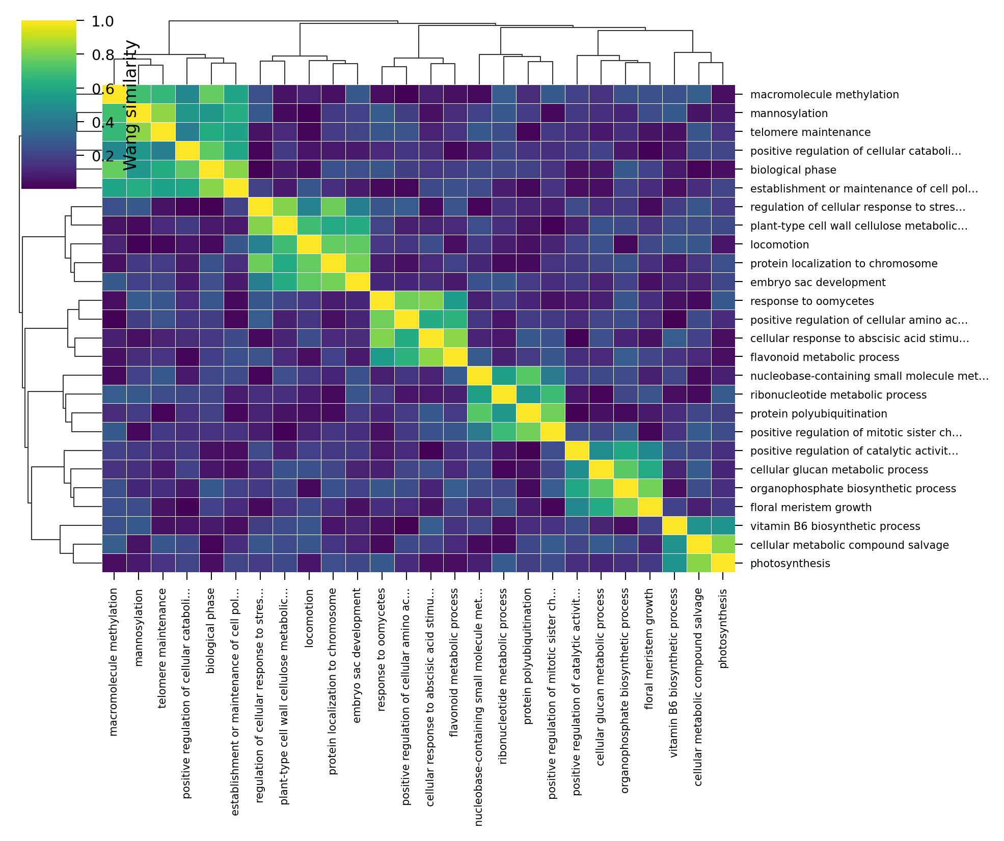
Similarity Heatmap
Visualize the similarity matrix as a heatmap. Using seaborn's clustermap also displays hierarchical clustering dendrograms, making the relationships between GO Terms intuitive to understand.
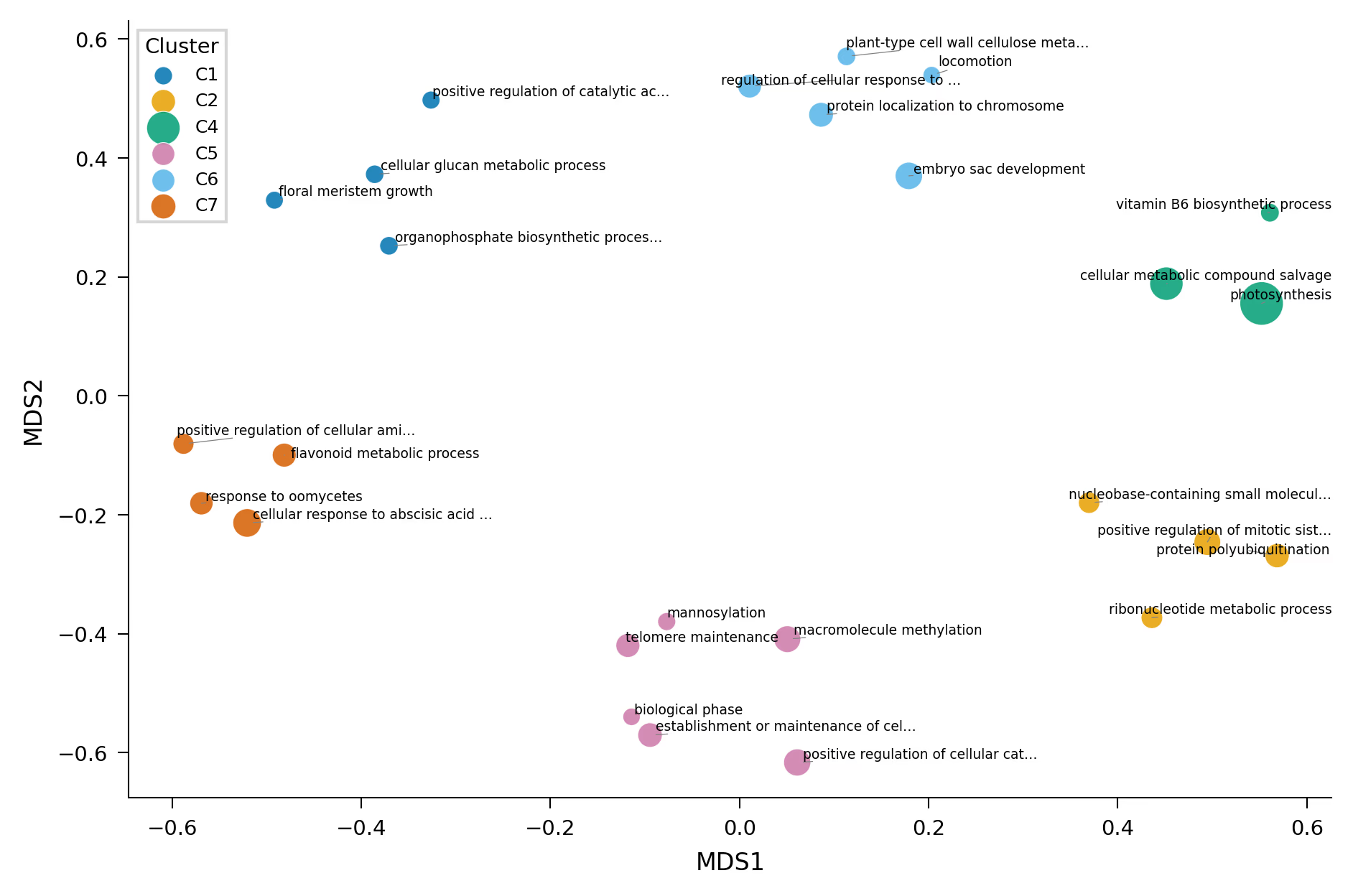
Reduce the similarity matrix to 2D using MDS (Multi-Dimensional Scaling) and visualize it as a scatter plot. This is the Python equivalent of the scatter plot in R's rrvgo. Semantically similar GO Terms are placed close together, making it useful for getting an overview of the enrichment results.
Code
from sklearn.manifold import MDS
from adjustText import adjust_text
import matplotlib.pyplot as plt
import seaborn as sns
# Convert similarity to distancedist_matrix =1- sim_matrix
np.fill_diagonal(dist_matrix,0)dist_matrix = np.clip(dist_matrix,0,None)mds = MDS(n_components=2, dissimilarity="precomputed", random_state=42, normalized_stress="auto")coords = mds.fit_transform(dist_matrix)df_plot = df.with_columns([ pl.Series("x", coords[:,0]), pl.Series("y", coords[:,1]),])# Nature colorblind-safe palette (Wong 2011)WONG_COLORS =["#0072B2","#E69F00","#009E73","#CC79A7","#56B4E9","#D55E00","#F0E442","#000000"]COL2 =183/25.4fig, ax = plt.subplots(figsize=(COL2, COL2 *0.65))clusters =sorted(df_plot.select("cluster").to_series().unique().to_list())for i, cluster inenumerate(clusters): subset = df_plot.filter(pl.col("cluster")== cluster) ax.scatter( subset.select("x").to_series().to_list(), subset.select("y").to_series().to_list(), s=[v *25for v in subset.select("score").to_series().to_list()], label=cluster, color=WONG_COLORS[i %len(WONG_COLORS)], alpha=0.85, edgecolors="white", linewidths=0.3,)# Automatically adjust label overlap using adjustTexttexts =[]for row in df_plot.iter_rows(named=True): texts.append(ax.text( row["x"], row["y"], row["name"], fontsize=4.5, ha="center", va="bottom",))adjust_text(texts, ax=ax, arrowprops=dict(arrowstyle="-", color="grey", lw=0.3))ax.legend(title="Cluster", frameon=True, edgecolor="0.8", fancybox=False)ax.set_xlabel("MDS1")ax.set_ylabel("MDS2")sns.despine(ax=ax)plt.tight_layout()plt.show()
You can also use UMAP instead of MDS. UMAP may be more appropriate when dealing with a large number of GO Terms.
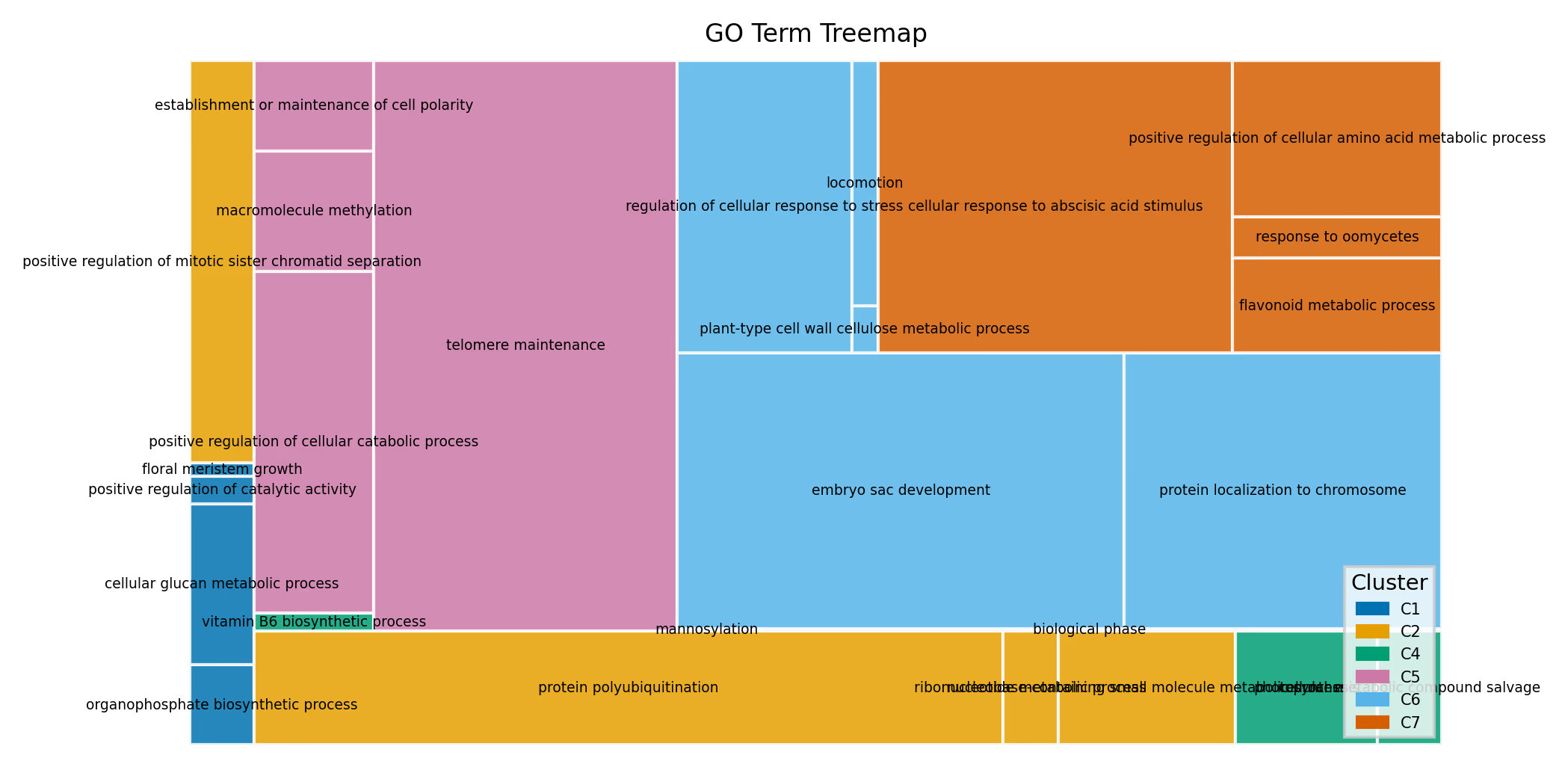
A treemap renders each GO Term as a rectangle, where the area represents size (gene count) and color represents the cluster. This is the Python equivalent of treemapPlot in R's rrvgo. It is well-suited for getting a bird's-eye view of the overall composition of enriched GO Terms.
Code
import squarify
import matplotlib.pyplot as plt
import matplotlib.patches as mpatches
WONG_COLORS =["#0072B2","#E69F00","#009E73","#CC79A7","#56B4E9","#D55E00","#F0E442","#000000"]COL2 =183/25.4fig, ax = plt.subplots(figsize=(COL2, COL2 *0.55))df_sorted = df.sort("cluster","score", descending=[False,True])sizes = df_sorted.select("size").to_series().to_list()labels = df_sorted.select("name").to_series().to_list()clusters_list = df_sorted.select("cluster").to_series().to_list()unique_clusters =sorted(set(clusters_list))color_map ={c: WONG_COLORS[i %len(WONG_COLORS)]for i, c inenumerate(unique_clusters)}colors =[color_map[c]for c in clusters_list]sizes_safe =[max(s,1)for s in sizes]squarify.plot( sizes=sizes_safe, label=labels, color=colors, alpha=0.85, ax=ax, text_kwargs={"fontsize":4.5,"wrap":True}, ec="white", linewidth=1,)handles =[mpatches.Patch(color=color_map[c], label=c)for c in unique_clusters]ax.legend(handles=handles, title="Cluster", frameon=True, edgecolor="0.8", fancybox=False, loc="lower right", fontsize=5)ax.axis("off")ax.set_title("GO Term Treemap")plt.tight_layout()plt.show()
Similarity Network (NetworkX)
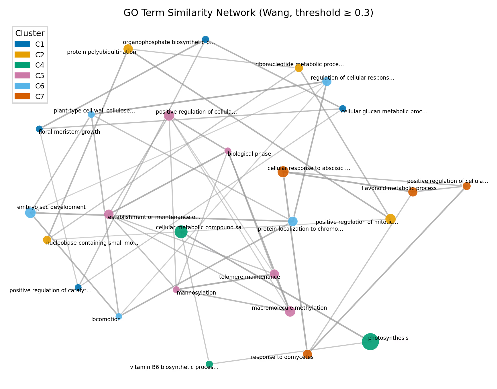
You can also use networkx to visualize the similarity between GO Terms as a network. Nodes represent GO Terms and edges represent similarity, with only pairs above a certain similarity threshold drawn as edges. The network uses a spring layout (force-directed), which places nodes with high similarity close together.
Code
import networkx as nx
import matplotlib.pyplot as plt
import matplotlib.patches as mpatches
from adjustText import adjust_text
WONG_COLORS =["#0072B2","#E69F00","#009E73","#CC79A7","#56B4E9","#D55E00","#F0E442","#000000"]df = pl.read_csv("example.csv")go_terms = df["term"].to_list()names = df["name"].to_list()scores = df["score"].to_list()sizes = df["size"].to_list()clusters = df["cluster"].to_list()unique_clusters =sorted(set(clusters))ccmap ={c: WONG_COLORS[i %len(WONG_COLORS)]for i, c inenumerate(unique_clusters)}# --- Build graph ---threshold =0.3# Draw edges for similarities above this thresholdG = nx.Graph()n =len(go_terms)for i inrange(n): G.add_node(i, label=names[i], cluster=clusters[i], score=scores[i], size=sizes[i])for i inrange(n):for j inrange(i +1, n):if sim_matrix[i, j]>= threshold: G.add_edge(i, j, weight=sim_matrix[i, j])# --- Plot ---COL2 =183/25.4fig, ax = plt.subplots(figsize=(COL2, COL2 *0.75))# Spring layout: places nodes with higher weight (similarity) closer togetherpos = nx.spring_layout(G, weight="weight", seed=42, k=1.5)# Edges: vary thickness and opacity based on similarityedges =list(G.edges(data=True))if edges: weights =[d["weight"]for _, _, d in edges] max_w =max(weights)for(u, v, d)in edges: w = d["weight"] alpha =0.15+0.6*(w / max_w) lw =0.3+1.0*(w / max_w) ax.plot([pos[u][0], pos[v][0]],[pos[u][1], pos[v][1]], color="0.6", alpha=alpha, lw=lw, zorder=0,)# Nodes: color by cluster, size by scorenode_colors =[ccmap[G.nodes[i]["cluster"]]for i in G.nodes]node_sizes =[G.nodes[i]["score"]*25for i in G.nodes]nx.draw_networkx_nodes(G, pos, ax=ax, node_color=node_colors, node_size=node_sizes, alpha=0.9, edgecolors="white", linewidths=0.3)# Labelstexts =[]for i in G.nodes: short = names[i][:30]+"…"iflen(names[i])>30else names[i] texts.append(ax.text(pos[i][0], pos[i][1], short, fontsize=4.5, ha="center", va="center"))adjust_text(texts, ax=ax, arrowprops=dict(arrowstyle="-", color="grey", lw=0.3))handles =[mpatches.Patch(color=ccmap[c], label=c)for c in unique_clusters]ax.legend(handles=handles, title="Cluster", frameon=True, edgecolor="0.8", fancybox=False, loc="upper left")ax.set_axis_off()ax.set_title(f"GO Term Similarity Network (Wang, threshold ≥ {threshold})")plt.tight_layout()plt.show()
You can adjust the network density by changing the threshold. A higher threshold retains only edges between highly similar pairs, while a lower threshold displays more connections.
Community detection using edge weights (e.g., the Louvain algorithm) is also possible.
# Community detection (Louvain method)# pip install python-louvainimport community as community_louvain
partition = community_louvain.best_partition(G, weight="weight")# partition: {node_id: community_id, ...}