Using UpSet Plots in Python
TL;DR
When showing inclusion relationships between sets, Venn diagrams are easy to understand for two or three sets, but as the number of sets increases, Venn diagrams become harder to interpret. A useful alternative is the UpSet plot, proposed by Alexander Lex in 2014. For Python, the following package is regularly maintained and reliable (as of August 2021):

For an R implementation example, please refer to this site.
UpSet Plots vs. Venn Diagrams
First, let's look at a comparison between Venn diagrams and UpSet plots.
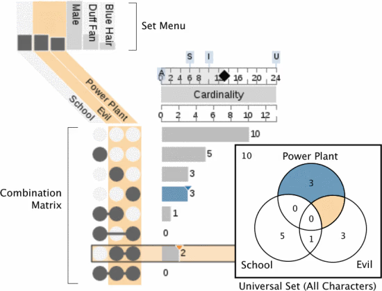 Figure 1. Venn diagram and UpSet plot (Lex et al., 2014 Fig. 4)
With around three sets, each has its pros and cons. UpSet plots seem more suitable for viewing quantitative relationships between sets.
Also, a merit of UpSet plots is their high extensibility. Since set relationships are represented as rows, additional data can be inserted into those rows. For example, they can be extended as follows:
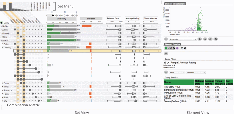 Figure 2. Extensibility of UpSet plots (Lex et al., 2014 Fig. 1)
Additionally, to express quantitative relationships between sets, you can sort by the number of elements in each set. Of course, you can also sort by the extended data.
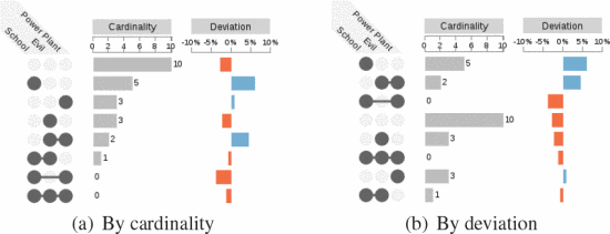 Figure 3. Sorting in UpSet plots (Lex et al., 2014 Fig. 6)
Python Implementation
Install
Generating Sample Data
The upsetplot package can generate sample data, so let's start by trying it with sample data.
Basic UpSet Plot and Venn Diagram
Venn Diagram
Let's create a Venn diagram using the sample data. We use matplotlib's venn3 to create the Venn diagram.
Output
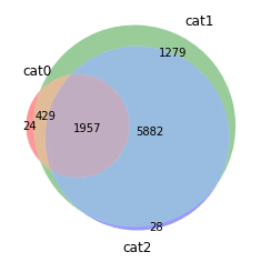
When the quantities are skewed, it becomes a bit hard to understand.
UpSet Plot
Let's create an UpSet plot using the same sample data.
Output
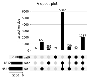
By separating quantitative relationships from set relationships, the visual understanding of quantitative relationships becomes easier. Conversely, the set relationships become slightly harder to understand.
Changing orientation and sorting are also easy.
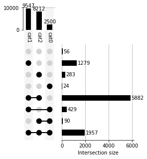
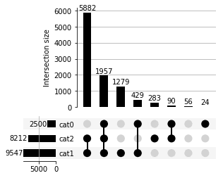
Extending UpSet Plots
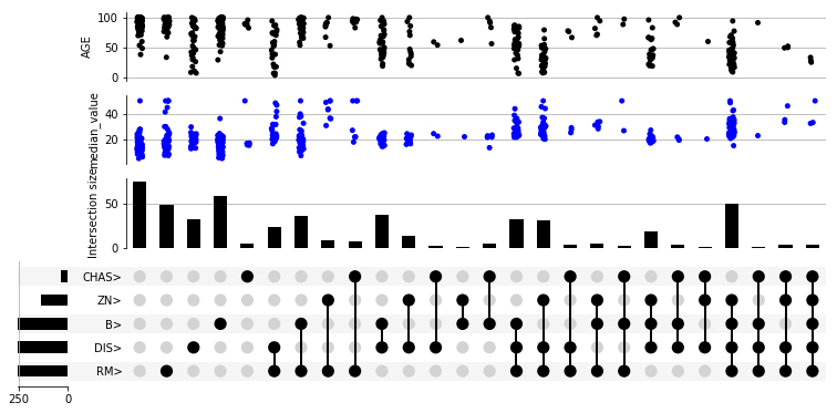
Let's try extending UpSet plots using the Boston housing dataset from scikit-learn.
Install scikit-learn if you don't have it. We also use pandas for data manipulation, so install that too.
For extensions, create an UpSet class and use the add_catplot method.
Creating UpSet Plots from Category Lists
In real-world data (such as differentially expressed genes from RNA-seq, etc.), you often create set relationships from category columns. Therefore, I'll also document how to create UpSet plots from sets containing categories.
Let each set of categories be category_n, and create an UpSet plot for three category sets.
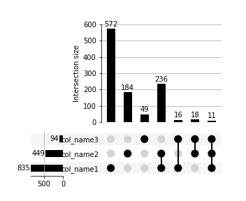
Once you get used to it, the dataframe operations are straightforward, but they were quite confusing at first, so I'm leaving this as a note. The key is initializing with True at the start.
Reference
- upsetplot Documentation
- Alexander Lex, Nils Gehlenborg, Hendrik Strobelt, Romain Vuillemot, Hanspeter Pfister,UpSet: Visual-ization of Intersecting Sets, IEEE Transactions on Visualization and Computer Graphics (InfoVis '14), vol.20, no. 12, pp. 1983–1992, 2014. doi: doi.org/10.1109/TVCG.2014.2346248